Working with an Illustrator
Designing a Cover for S.E. Reid
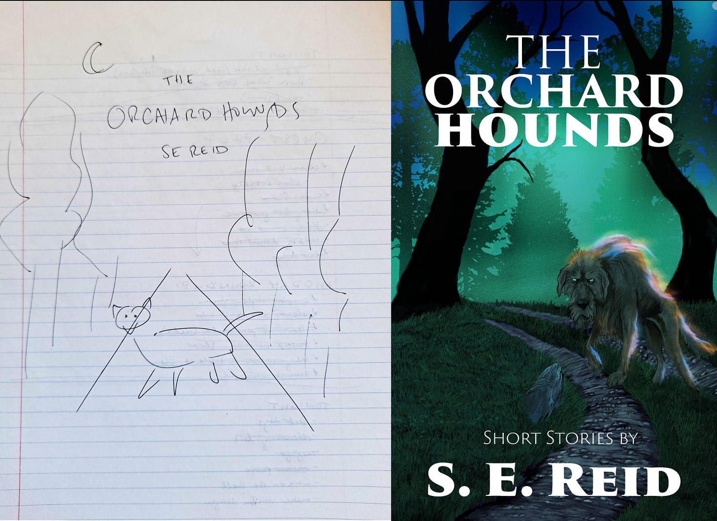
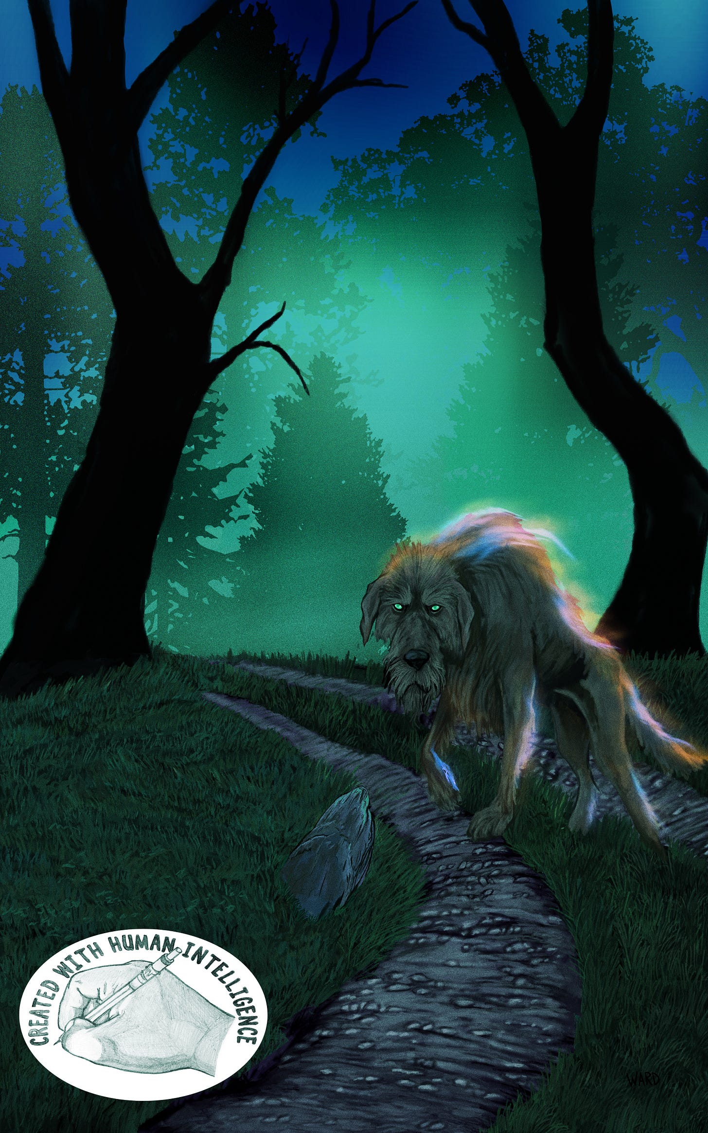
S.E. Reid was kind enough to commission me to do the cover for her forthcoming project. I really enjoyed working with her and helping her to visualize her ideas. I wanted to share a little behind the scenes of how that happened. Most of the time clients will just describe what they want. Sally did that as well. She said that she wanted ”a menacing, spectral ghost hound crossing a road in a forest.” She also took the extra step to make a drawing of the idea in her head. I double-checked with her to make sure she was okay with me sharing this and she is. You can see her original drawing and my finished painting (no AI) below.
There are some areas where I deviated from her original idea. Originally, I wanted to include glowing fireflies as well, but that doesn’t work because of where the story is located.
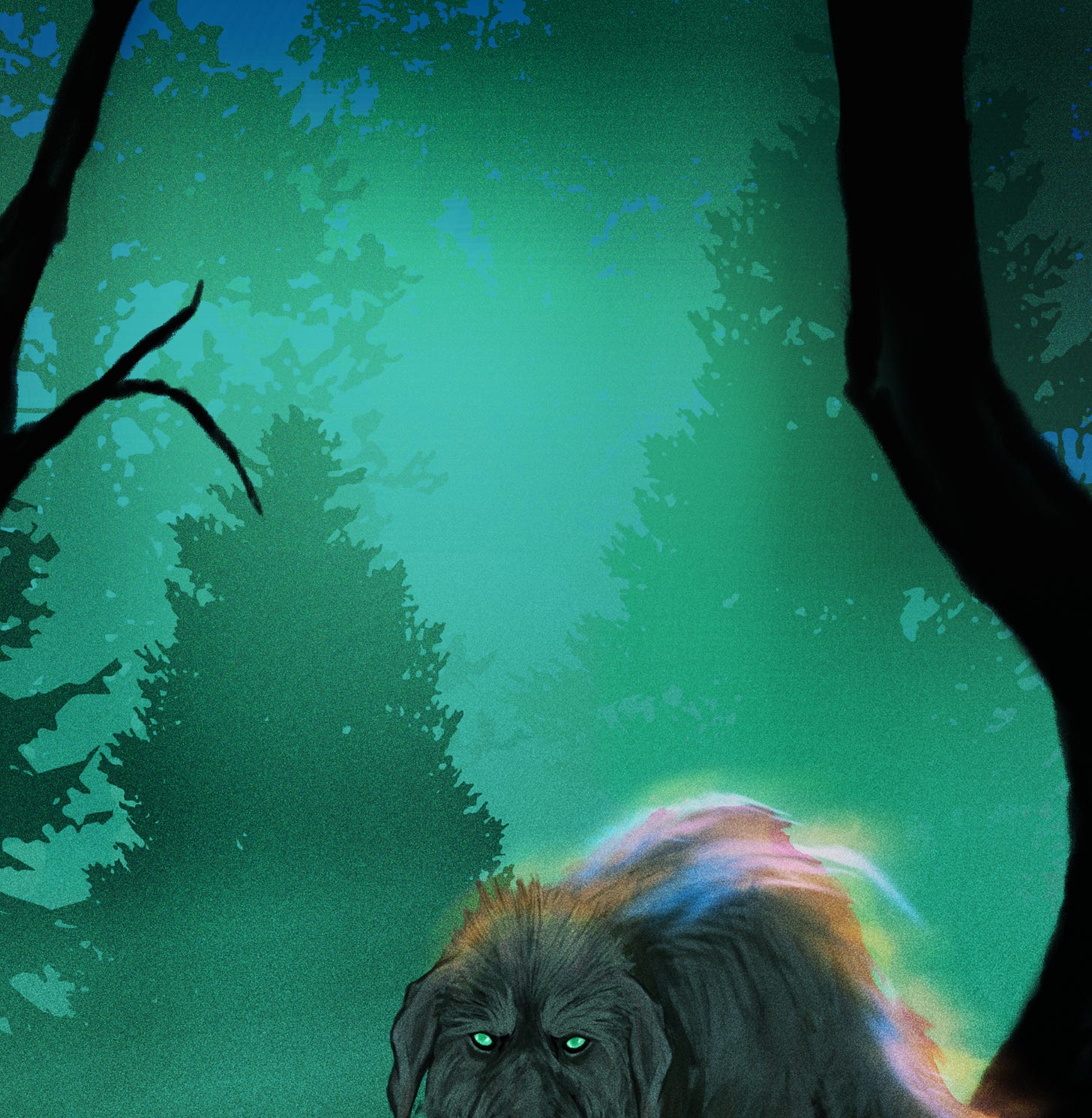
I didn’t include the moon because I wanted to play with the background lighting to not only create a sense of depth but also of magic/mystery. I was thinking about the northern lights, but I didn’t want to lean into it too heavily because I wanted the lighting to be ambiguous and open to interpretation.
Finding that right balance between what the client wants and what makes for a good image is the main thing an illustrator does. Sure, it’s the painting part is a big component, but more than that it’s interpreting their wishes in a way that achieves their goals even if they can’t vocalize or explain what they’re looking for.
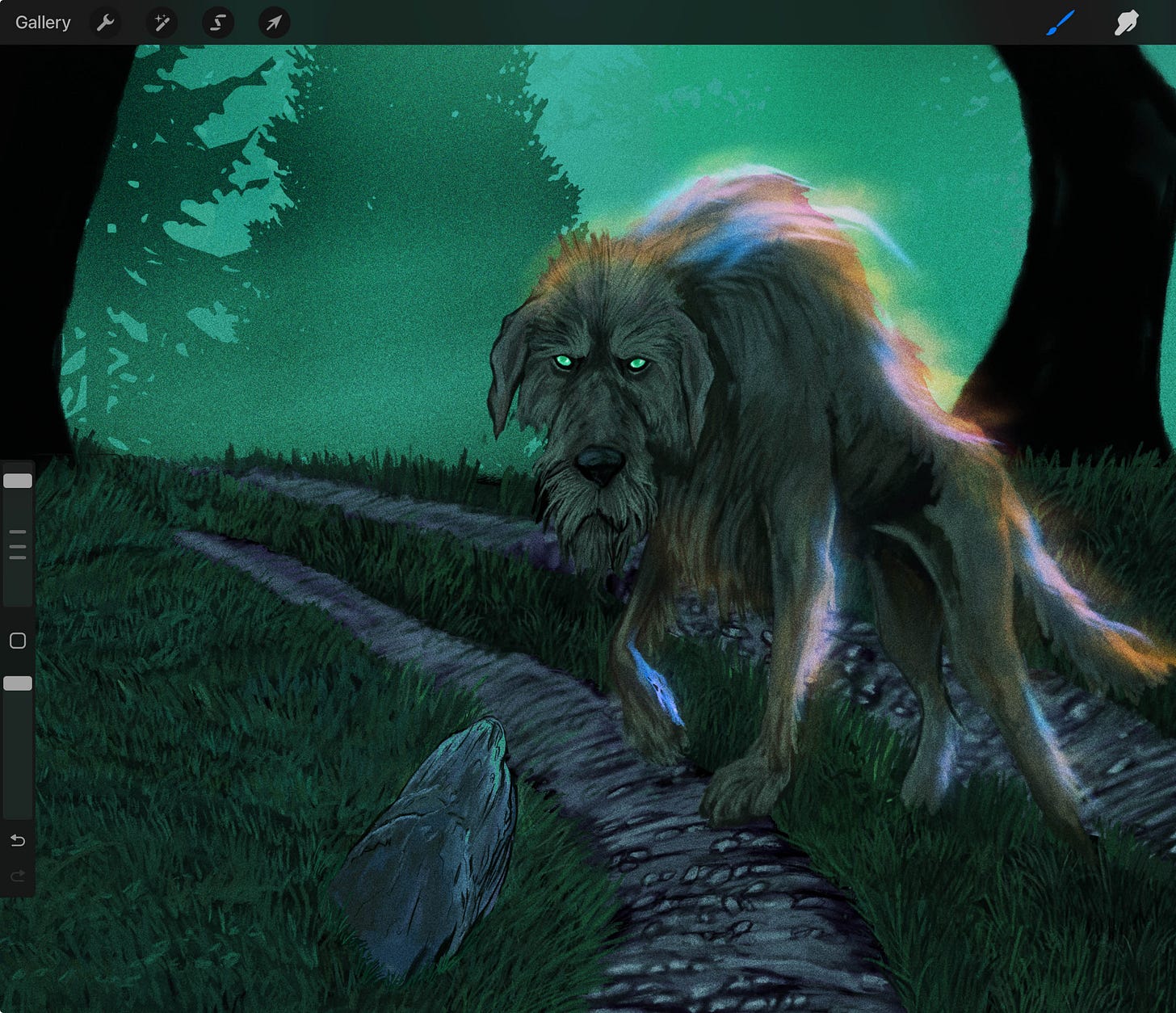
This is why for most of my illustration work I work digitally. It allows me to quickly iterate and change things in ways that simply wouldn’t be possible working traditionally. Don’t get me wrong. When I say I work digitally, I’m still manually sketching and painting everything out entirely by hand, but working on a computer allows me to easily more easily manipulate the image to my client’s whims. Also, there is Undo… which doesn’t exist with real life media. I still enjoy drawing and painting with real world pencils and paints, but the older I get the more I appreciate the ability to zoom in to see things that would have me squinting in the real world.
The lighting on the hound went through several variations. I understood that she wanted muted lighting, but I wanted to use the lighting as a way to make the wolfhound stand out against the background and to better attract attention. This was my attempt to do that.
While I was experimenting with ways to make the fire-type lighting more muted, I stumbled onto giving it tints of blue and knew that I had the winner. I showed the image to Sally and we were done.
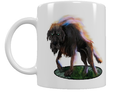
I understand that many artists want to re-use their book cover assets for things like t-shirts and coffee mugs. This is an area where digital really shines because as long as you have painted different components on different layers, you can toggle visibility of those layers on or off.
For that reason, it wasn’t too much work to provide an altered version of the ghost hound on a transparent background. It was about twenty minutes of work to pull the dog out and clean up some rough edges or create a border for the grass on which he stands. The big thing here is that it provides an image with a transparent background that Sally can use for coffee mugs and things like that.
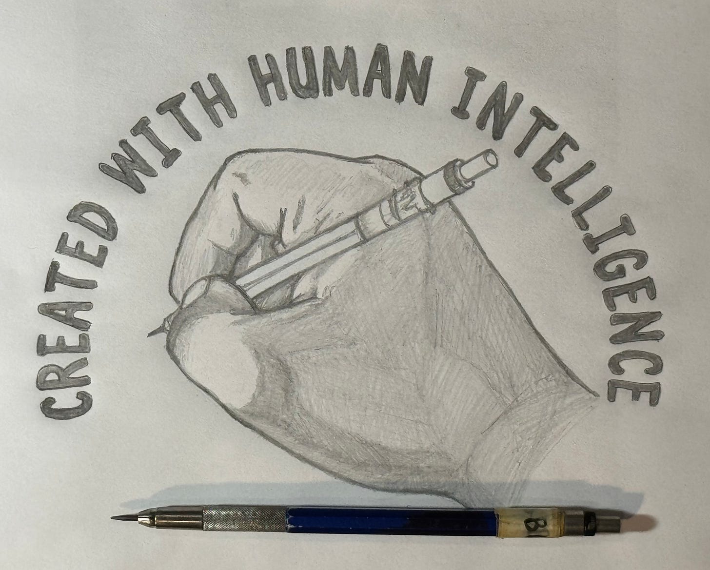
Lastly, I’ve decided to jump into Beth Spencer Created with Human Intelligence campaign by making my own version of her badge and attaching it to the image. While I do professional work digitally, the spirit of Beth’s campaign seems to be to make the badges traditionally. So, that’s what I’ve done. You can see my version of the badge below:
And here’s the badge affixed to my cover art. I will disclose that I did do some digital clean-up for my lettering because I wanted it to look cleaner than the version I did in pencil.
Good luck on your launch, Sally!






Insanely bad ass brother. You’re so talented and being able to see your process is awesome. Thank you for letting us into that space.
when i retired from MSFT i snuck off with my then old, now ancient ipad and one of the guys on my team got me an Apple Pencil. First thing I bought Procreate and had a lot of fun but it does have a bit of a learning curve and I'm not artistic - AT ALL. very unfortunate. When I got the new iPad I also got a new pen (old one wouldn't work with new iPad) so I really need to start playing around in Procreate again. Most of the work I do is logos/branding for my small biz clients and I haven't found a way to get a vector graphic out of procreate.